How to Map Filters in HF
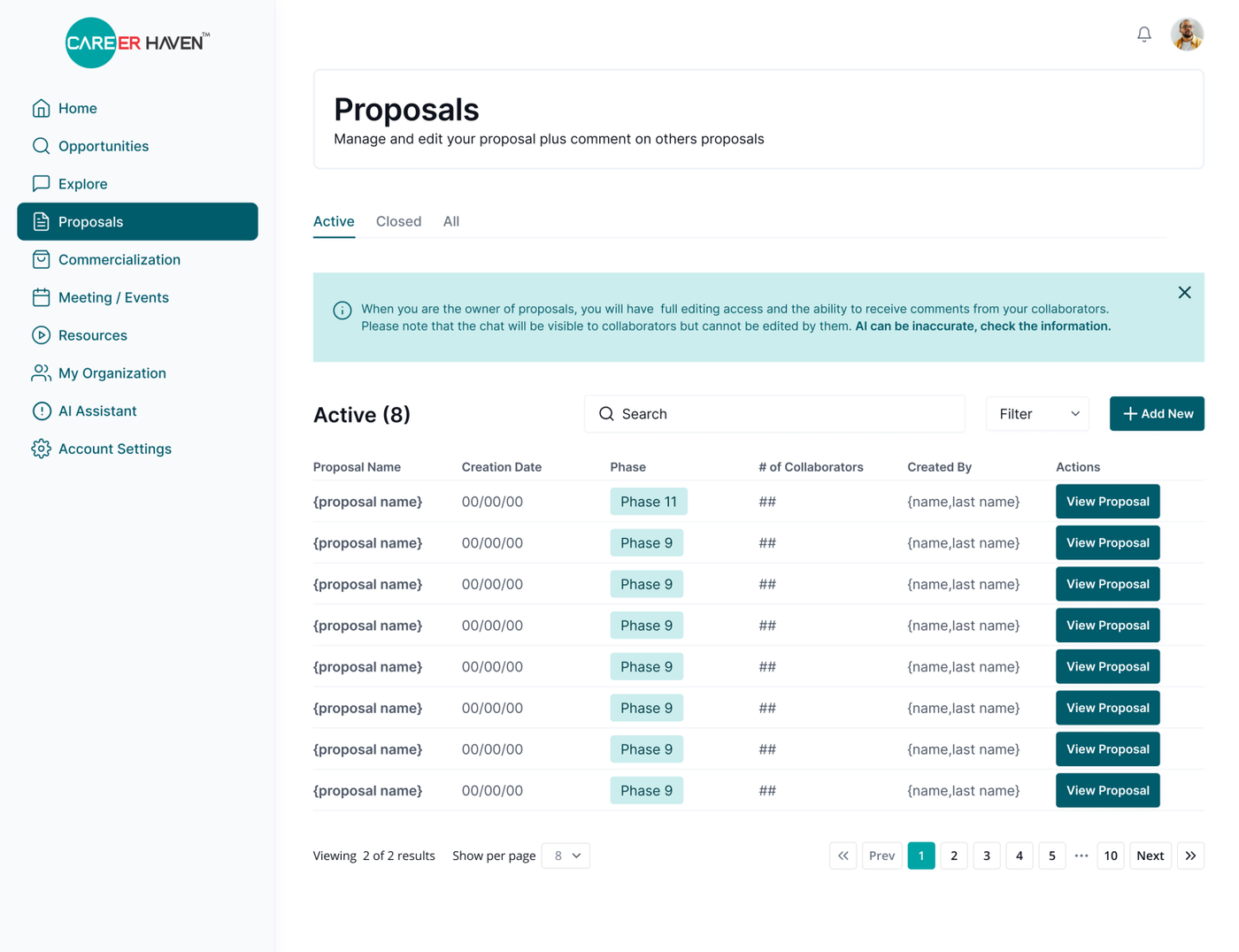
When working on the high-fidelity designs, at least one screen must showcase how the filters will appear and function. The filters should be clearly mapped out to ensure developers understand their behavior and layout.
Keep in mind which component is most appropriate for each case:
-
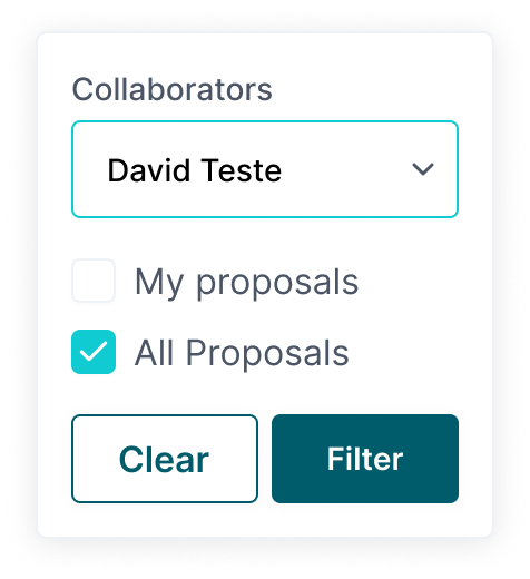
Checkboxes should be used when there are multiple options and users can select more than one. An additional 'Select All' option can be provided if needed.
-
Dropdowns are best when there are only a few options and the user needs to make a single selection
[This is because checkboxes take too much space, and dropdowns are much cleaner]
Each filter component must be included in the UI Kit for consistency and ease of development.
For example:
Screen without active filter:
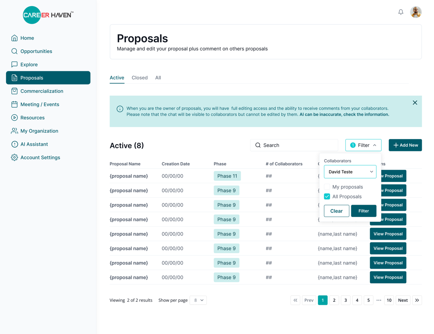
Screen with active filter
When a filter is selected, the border of the filter component changes to the selected color to indicate it's active. Additionally, a circle displaying the number of active filters appears next to the filter title, providing clear visual feedback.

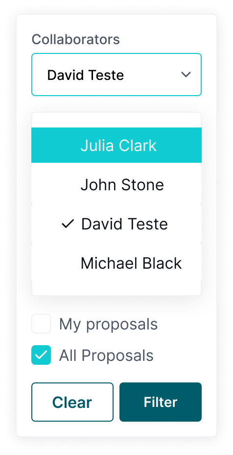
Screen with expanded active filter
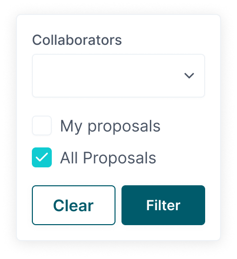
| Collapsible Collaborator Filter with NO active selection | Expanded Collaborator Filter with active selection | Collapsible Collaborator Filter with active selection |
 |
 |
 |