FlutterFlow High Fidelity Screens
Once the Low-Fidelity design is approved, we move on to creating the High-Fidelity screens. Below is a step-by-step guide on how to proceed with this phase of FlutterFlow high fidelity screens.
Instructions:
1. To create high-fidelity wireframes for apps in FlutterFlow, we have created the FF Template, which will make the design process faster. This library has also been created in FF and will help devs to gain time, because they will no longer need to focus on thinking how design will look and being able to see it there
Get latest Figma file FF Template
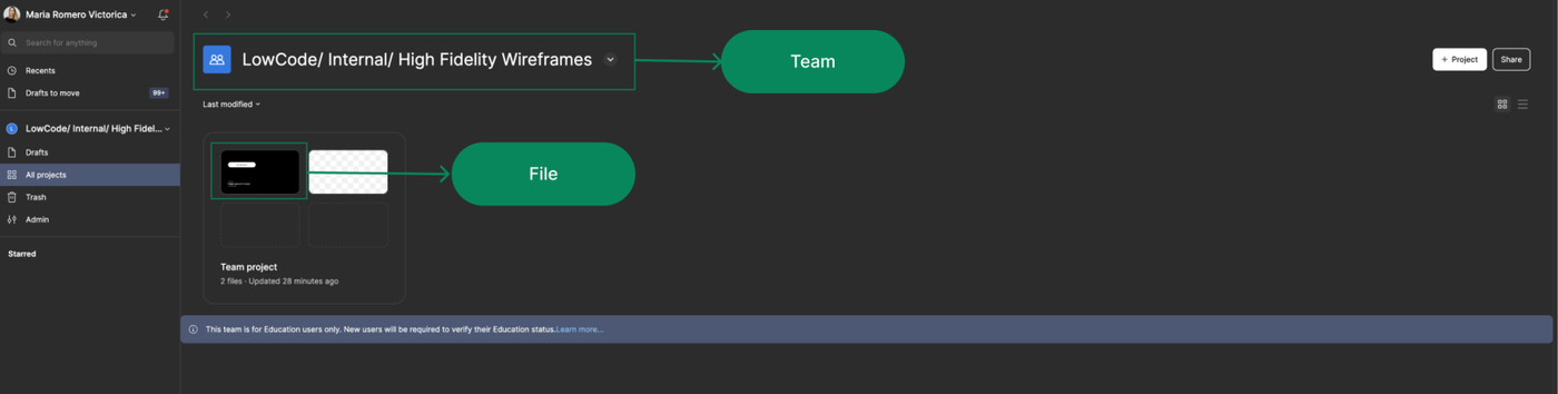
2.When you have started the High Fidelity phase, duplicate the file FF Template and save it in the corresponding team folder using the following naming convention: LowCode/ {year}/ {Project Name} For example: LowCode/ 2024/ Internal App.
Once the team is created, please transfer the file ownership to: catalina@lowcode.agency. If you encounter any issues with creating teams, please reach out to Catalina for assistance.
3. Create the pages* we’ll need to organize everything related to the project:
✅ 01. Project Cover
⭐️ 02. Project App Designs
🎨 03. UI Kit & Grids
📁 04. Brand Assets & Design Elements
🗑️ 05. Drafts [Ignore]
💱 06. Icons
🧩 07. Components
These are the pages we usually create, but additional pages can be added if necessary.
- ✅ 01. Project Cover
- ⭐️ 02. Project App Designs
- 🎨 03. UI Kit & Grids
- 📁 04. Brand Assets & Design Elements
- 🗑️ 05. Drafts [Ignore]
4. The next step is to customize the file with the client’s branding elements.
This includes:
- Colors: (using variables).
- Typography (if applicable).
Typography: ideally from Google Fonts. If the client wants some particular font, and they have the file ready, we can use it. But if we're designing, let's choose from Google fonts
File Pages:
✅ 01. Project Cover:
The Project Cover is created to ensure that when accessing the team, the project has a clear cover page, making it easy to identify. Additionally, it serves as an 'introduction' to the project. Make sure to set the cover as the project's thumbnail.
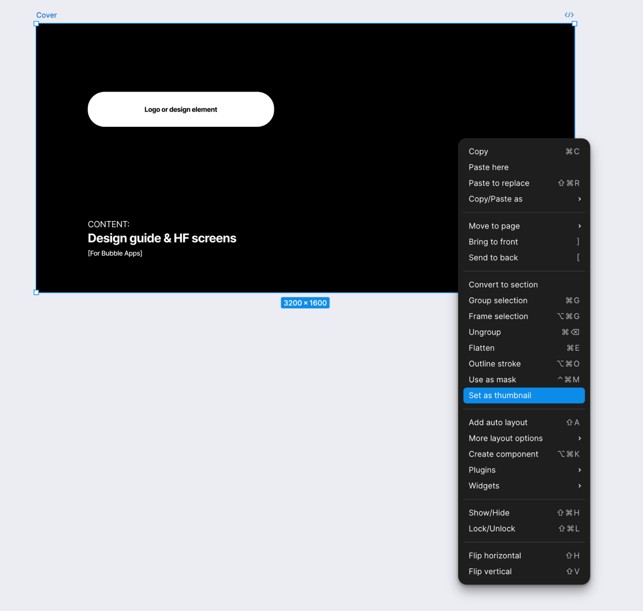
To set it as the Project Thumbnail, select the frame, right-click, and choose the option 'Set as Thumbnail'.
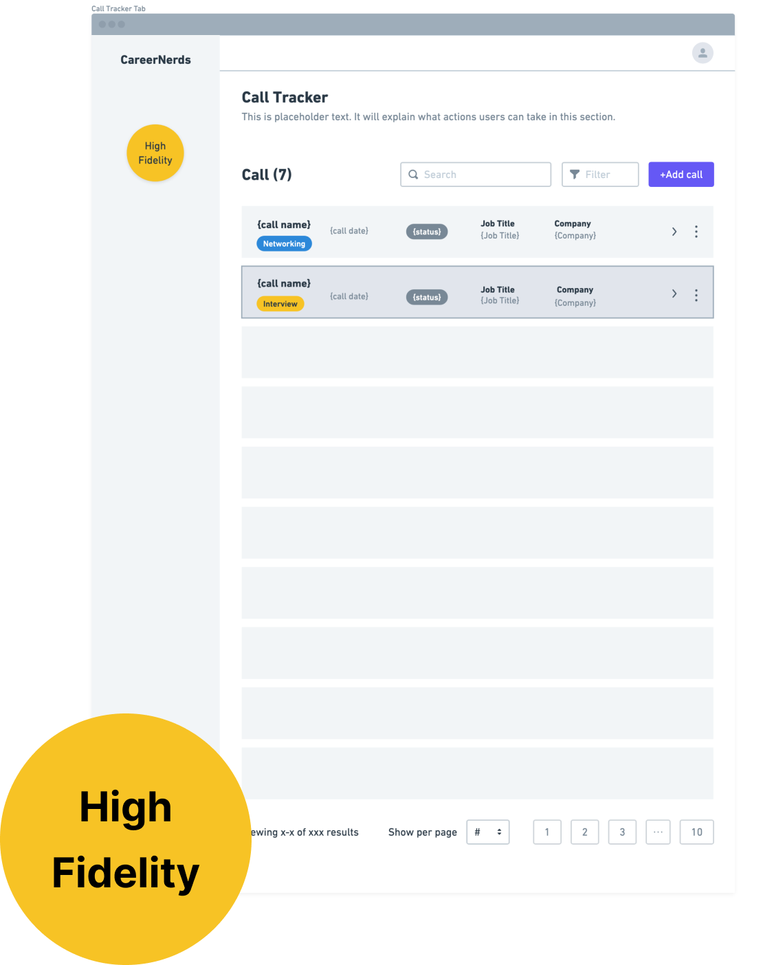
⭐️ 02. Project App Designs
This is where we will include the app screens designed by us.
Some screens come almost pre-built 'by default', such as:
- Log In / Sign Up
- ‘Add Your Details’
- Account Settings
All we need to do is add the client's logo, apply their design, and, of course, make sure the fields match what was defined in the low-fidelity wireframe.
Designers need to always add the HF screen for "Password successfully changed."
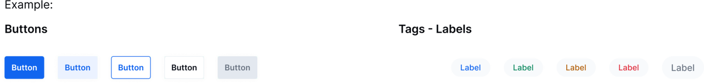
🎨 03. UI Kit & Grids
To assemble the UI Kit, we need to have the 'styles' configured. Once the screens are built, we will collect as many elements as possible that we used to create the screens and include them in this section. Be sure that the elements are organized according to their function (e.g., Buttons, Inputs, Cards, etc.).
We will also include elements from the Atomic pages—components that you believe will be present in the app, even if they aren’t part of the presented screens (refer to the low-fidelity wireframe for this!). We need to add all button instances, default, hover, active (while pressed) and inactive.
It is crucial to add the Images section, this way devs can easily download them
Grids
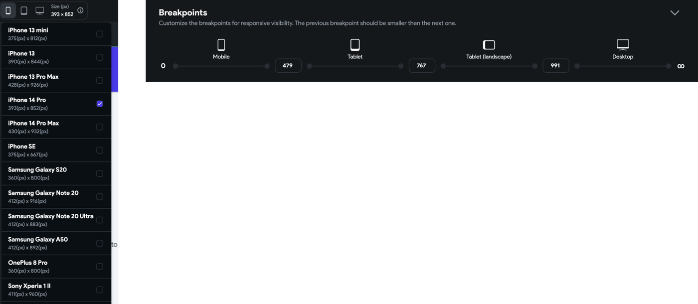
FlutterFlow works with different sizes. When designing in mobile we need to design for Iphone 14 Pro 393px (width).
In the UI Kt & Grids we need to specify the:
- Default border radius of components
- Default padding for app’s structure
📁 04. Brand Assets & Design Elements
In this section, we will include everything the client has provided for us to create the designs. This might includes:
- Logo (and its variations)
- Graphic elements, if applicable
- Images (ask if they have any images we can incorporate into the app) If the client doesn't provide images and we want to find some to make the app more visually appealing, we must ensure they are free and copyright-free.
- Color palette and how it is implemented (if applicable)
- Reference (any visual reference that the client has provided)
Use this template by copying and pasting the elements that you need it into your own Figma file.
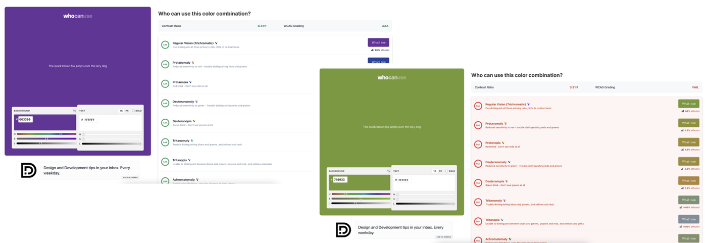
It is very important that once the client provides their colors (and their implementation, if available), we perform an accessibility check to ensure that the contrast of the implementation meets accessibility standards. For this, we use the website Who Can Use and take screenshots to support our decision or to show the client how their colors align with this issue.
🗑️ 05. Drafts [Ignore]
In this section, we will include everything that we don’t want the client to see, such as drafts, trash, etc.—things we want to delete permanently but don’t want to store in other folders.
What we usually save there are drafts of the process to keep a record, but it’s up to each designer to decide how much 'material' to save. For example, if we change the color of a button, we don’t save that as evidence, but if there are changes to sections and/or layouts, it’s advisable to keep a history.
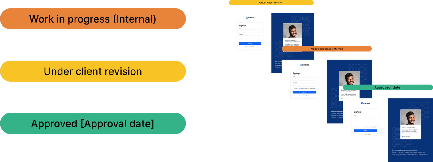
🚦 Status bars
To keep the wireframe organized, we need to assign statuses to the screens we are designing. The statuses are as follows:
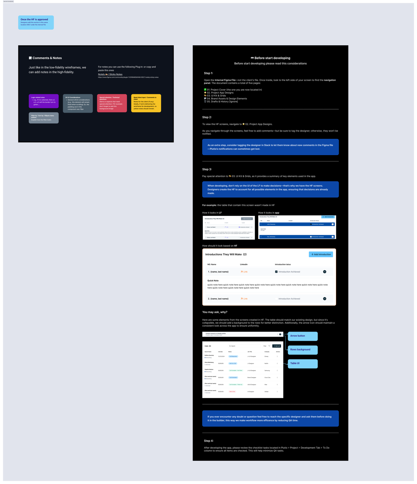
🗒️ Comments & Notes
Just like in the low-fidelity wireframes, we can add notes in the high-fidelity ones, maintaining the same color-coding used in the low-fidelity versions.
For notes you can use the following Plug-in: Notely ✍🏼 | Sticky Notes
These notes don't have a native arrow; for connecting the notes to the components, please use this plug-in: Autoflow
On the ⭐️ 02. Project App Designs you will will need to add the Comments & Notes section + the doc Before start developing
👤 Client File Copy
To share the wireframes with the client so they can provide feedback or simply view the progress of their project, we don’t share the working wireframe. Instead, within the team, we create a separate file where we build these pages:
- ✅ 01. Project Cover
- ⭐️ 02. Project App Designs
- 🎨 03. UI Kit & Grids
- 📁 04. Brand Assets & Design Elements
- 🗑️ 05. Drafts & History [Ignore]
When sharing the file to the client, make sure they have ‘View Access’ so they can view and write comments.