LF Wireframe Notes & Status
To maintain a structured and clear representation of project statuses, notes, and screen flows through color coding. This ensures all team members and clients can easily understand and track the progress and requirements of the wireframes.
All Whimsical Wireframe are created with this information LF Wireframe Notes & Status Example
Scope: This SOP applies to all team members involved in the design, development, and review of wireframes for client projects.
Responsibility:
- Designers
- Developers
- Project Managers (PMs)
- Business Analysts (BAs)
- Clients
Definitions:
- Low-Fidelity (LF) Wireframes: Basic sketches or digital drawings that represent the layout and functionality of a user interface.
- High-Fidelity (Hi-Fi) Designs: Detailed and polished visual representations of the final product.
Procedure:
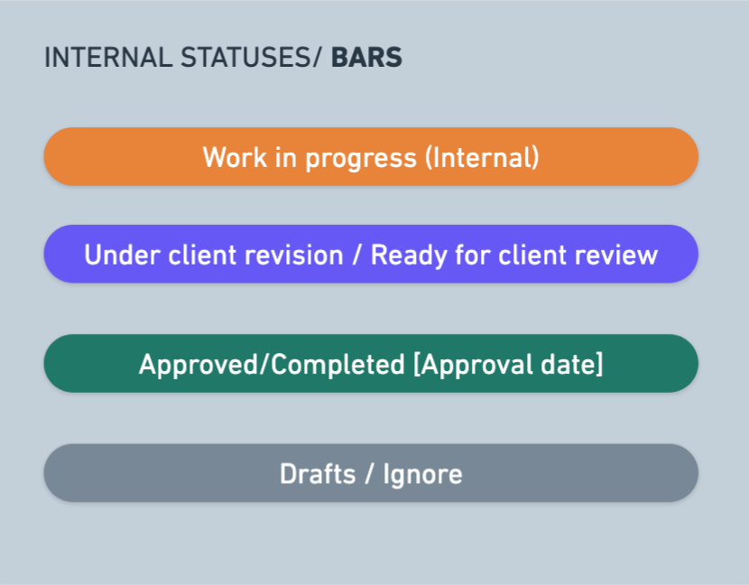
Internal Statuses/Bars
-
- Purpose: To provide a quick overview of the status of screens and flows.
- Usage: Place the bar at the top of the wireframe and list the corresponding screens below it.
- Example: A bar labeled "Work in progress (Internal)" with screens listed underneath indicates those screens are currently being developed

Notes/Color Coding

Dark Purple: Logic related notes.
- Usage: Note anything related to logic or functionality. These are essential for developers, clients, and designers to understand the logic behind the screens.
Pink: Redirects/opens X screen.
- Usage: Indicate that a specific action will open another screen. Include a link to the screen within the wireframe or note if it redirects to an external site.
- Example: "This action will open [screen name]" with the screen name linked.
Blue: General notes.
- Usage: Write notes that do not fit into other specific categories.
Yellow: Needs client input.
- Usage: Highlight notes that require confirmation or input from the client. These notes should be resolved and updated by the end.
Red: Alerts
- Usage: Alerts or aspects that need special attention or technical questions that might need dev input.
Dark Gray: UX/UI Considerations.
- Usage: Write considerations related to user experience and interface design, such as "searchable dropdown."
Light Gray: Filter by/Sort by.
- Usage: Indicate filtering and sorting options for data display.
Yellow Circle Tag
- Purpose: To specify which screens will be designed in high fidelity.
- Usage: Tag relevant screens with a yellow circle to indicate they will receive detailed and polished designs.
Red Special Notes:
-
General Notes
Use red sticky notes to capture developers’ attention. These notes should highlight important considerations. Place them at the beginning of the entire wireframe if the information applies globally.
Example: “All documents generated in the wireframe must first be written in English, followed by a Spanish version.”Flow-Specific Notes
At the start of each flow, include a red sticky note summarizing the main user action for that flow, based on the user matrix. This ensures developers clearly understand what the user can or cannot do.
Example: “In this flow, the user can view all company assets, can edit assets related to their department, but cannot edit any other assets (only the Super Admin has this permission).

Documentation or References:
