Popular CSS used by Glide Dev
1. Purpose
This SOP outlines the process for developers to apply and customize CSS within Glide Apps to enhance the visual appearance and user interface, ensuring consistency with the design specifications.
2. Prerequisites
-
Access to project design documents
-
A Glide Apps account with editing permissions
-
Basic knowledge of CSS syntax and styling principles
-
Understanding of Glide limitations regarding CSS injection (as not all customization options may be supported natively)
3. CSS that is currently popularly used (constantly updated)
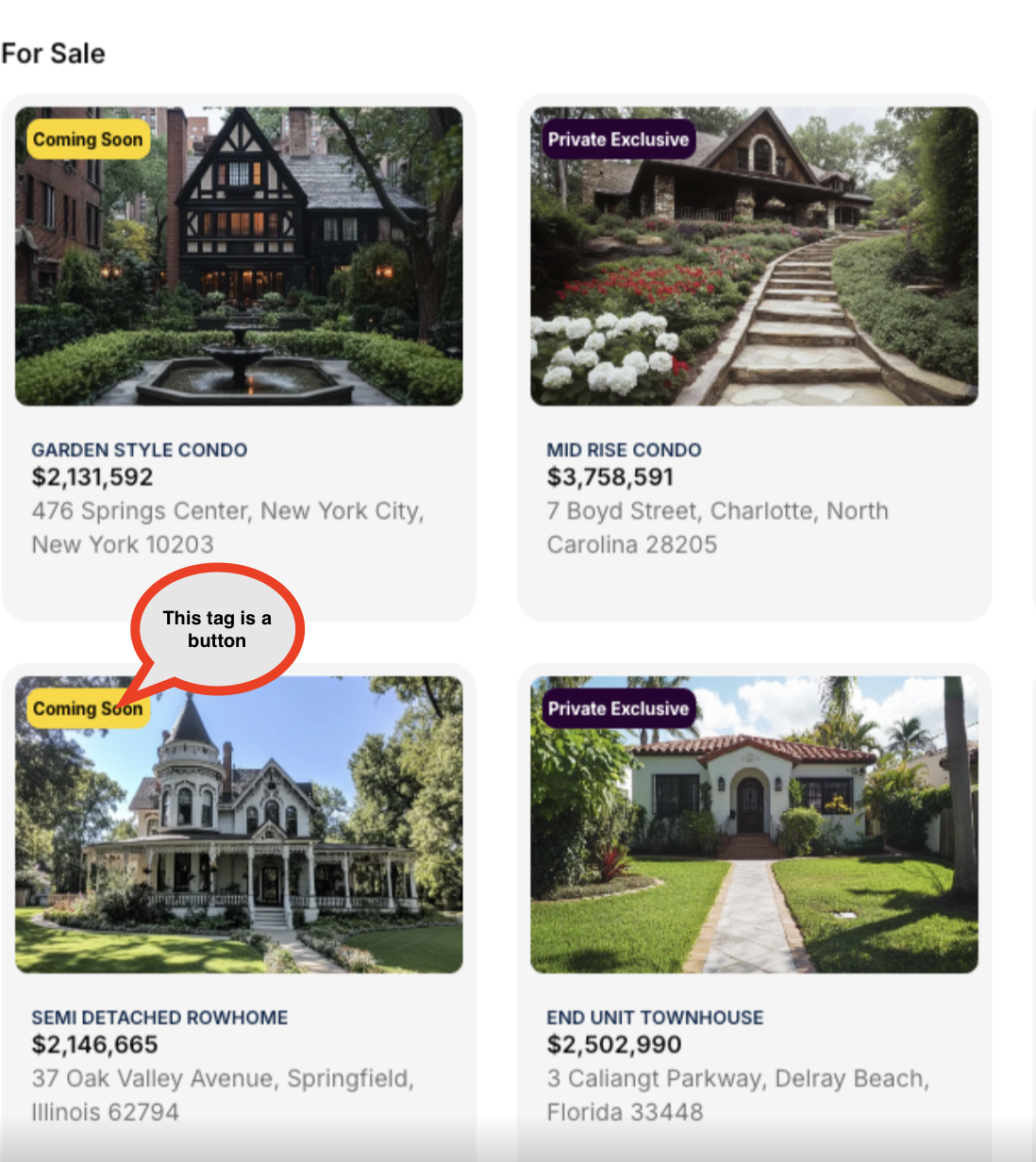
Prevent Submit
Purpose of use
Prevent submit CSS is very useful to prevent the form from submitting when there are several fields that are required to be filled in.
Components to use
The component used is "Rich Text format" which contains <div></div> which is located on the form page that has a button.
CSS Class
prevent-continue
How to use
Create an If column in the database or other conditional column that gives a TRUE value if all fields must be filled by the value, fill the CSS class with "prevent-continue" in the Rich Text format component.
Enter the code below in the Costum CSS field:
#page-root:has(.prevent-continue) [aria-label="Continue"] {pointer-events: none;opacity: 0.4;}in the aria-label section must be adjusted to the button label that is in the same screen as the Rich text format component earlier.
Sample Image

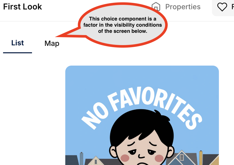
Choice filter
Purpose of use
Provides a more page-friendly view that has multiple screens on a single page.
Components to use
Choice components with chip style options
CSS Class
choice-filter
How to use
Give the CSS class code to the choice component, copy the code below to the Costum CSS field
.choice-filter ul {border-style: none;} .choice-filter li {border-width: 0px;} .choice-filter li.selected, .listing-view:not(:has(.selected)) li:first-child {font-weight: 700;background: none;border-radius: 0px;border-bottom: 2px solid var(--gv-text-contextual-accent);color: var(--gv-text-contextual-accent);} .choice-filter li {font-size: 16px;}Sampel Image
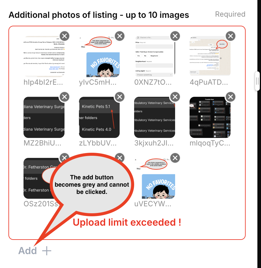
Limits file uploads to 10
Purpose of use
Putting a limit on uploading files to save the limited storage of glide.
Components to use
Image Picker
CSS Class
limitToUpload
How to use
Give the CSS class code to the Image Picker component, copy the code below to the Costum CSS field
#page-root:has(.limitToUpload [data-testid="picker-image"]:nth-child(11)) [aria-label="Submit"], #page-root:has(.limitToUpload [data-testid="picker-image"]:nth-child(11)) .minimalPrimary {pointer-events: none;opacity: 0.4;} #page-root:has(.limitToUpload [data-testid="picker-image"]:nth-child(11)) .limitToUpload .component-root > div > div > div:nth-child(2){border:1px solid red;} #page-root:has(.limitToUpload [data-testid="picker-image"]:nth-child(11)) .limitToUpload .component-root > div > div > div:nth-child(2):after{content:"Upload limit exceeded !";display: flex;padding-top: 10px;color: red;justify-content: center;font-weight: 600;}Sampel Image
Aspect Ratio
Purpose of use
Adjust the aspect ratio of the image component
Components to use
Image
CSS Class
set-aspect
How to use
Give the CSS class code to the Image Picker component, copy the code below to the Costum CSS field
.set-aspect div[class*="aspect-square"] .aspect-container {aspect-ratio: 16 / 9;}
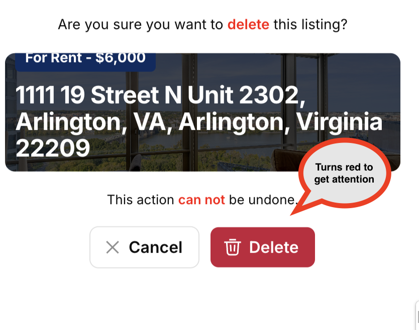
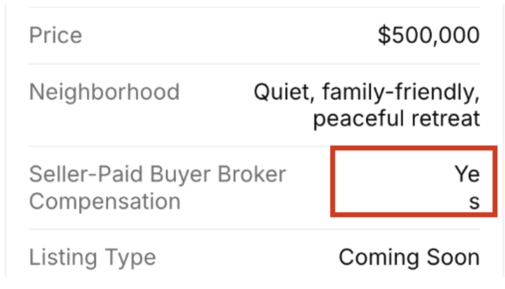
Change the color of the button
Purpose of use
Adjusting the color, for example in this case is changing the red color of the delete button
Components to use
Button
CSS Class
Not required
How to use
Copy the code below to the Costum CSS field, make sure the aria-label value matches the button label
button[aria-label="Delete"].filled {background-color: #8B0000;}Sample image
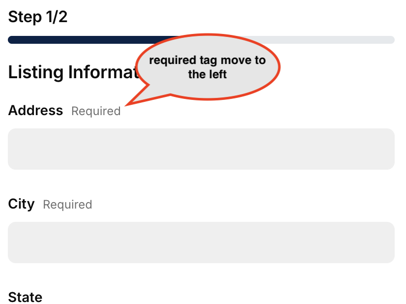
Align the "required" from right to left
Purpose of use
Impress the reader to pay more attention to the required tag
Components to use
Entry Component that displays required tags
CSS Class
Not required
How to use
Copy the code below to the Costum CSS field
[data-testid="wf-required"], [data-testid="wbp-required"], div[class*="wire-field___StyledDiv6"], div[class*="wire-choice___StyledDiv3"] {margin-right: auto;}Sample image
Don't Break text on field
Purpose of use
Prevent values (could be long text) in field components from splitting downwards when the screen is narrow (phone display)
Components to use
Field
CSS Class
Not required
How to use
Copy the code below to the Costum CSS field
div[class*="fields___StyledDiv3"] {word-break: keep-all;}Sample Image

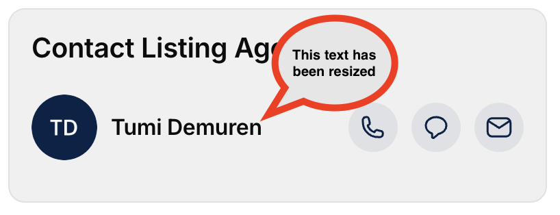
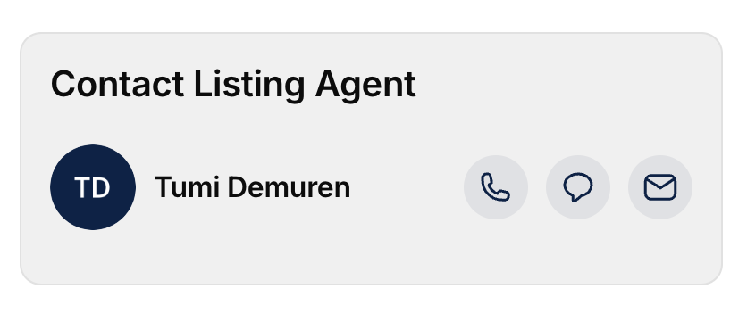
Adjust Action Row font size
Purpose of use
Adjust the font size of the action row.
Components to use
Action row
CSS Class
text-fontsize
How to use
Give the CSS class code to the Action Row component, copy the code below to the Costum CSS field
.text-fontsize div[class*="wire-action-row___StyledDiv2"]{column-gap: 0.5rem;} .text-fontsize p[class*="wire-action-row___StyledText2"] {font-size: 14px;}Sample Image
Modify Group Title
Purpose of use
Modify the appearance of the group title
Components to use
Table Component
CSS Class
group-title
How to use
Give the CSS class code to the Table component, copy the code below to the Costum CSS field
.group-title h3[class*="headlineXSmall"] {background: #092b60;color: white;display: inline-block;padding: 0.2em 0.8em;border-radius: 1em;font-weight: 700;margin-top: 10px;}Sample Image

Coloring Container Card
Purpose of use
Give color to the container that has been set to be a card display
Components to use
container that has been set to be a card display
CSS Class
grey-box
How to use
Give the CSS class code to the Container component, copy the code below to the Costum CSS field
.grey-box div[class*="pages-component-renderer___StyledDiv7"] {background: #F0F0F0;}Sample Image
Adding Meta text like classic app
Purpose of use
Provide meta tag information display like the classic app that previously existed in the glide component
Components to use
Card Component
CSS Class
meta-card
How to use
Add a button to the Collection Action Item, Give the CSS class code to the Card component, copy the code below to the Costum CSS field
.meta-card div[class*="card-collection-card___StyledDiv3"] [class*="card-collection-card"] {position: absolute;top: 15px;left: 15px;width: auto;padding: 0px 4px;} .meta-card button[class*="card-collection-card"] {font-size: 10px;font-weight: 700;background: #092b60;color: white;}Sample Image
Remove Hyphens
Purpose of use
Removing unnecessary Hyphens so that content widths match each other
Components to use
Collection Component
CSS Class
Not required
How to use
Copy the code below to the Costum CSS field
div, p, h1, h2, h3, h4, h5, span {hyphens: none !important;}Sample Image
Turn Buttons into Titles with Icons
Purpose of use
Giving the option to use icons in Glide for the title.
Components to use
Button
CSS Class
required
How to use
Copy the code below to the Costum CSS field
.buttonAsTitle button {padding: 0 !important;font-size: 1.3125rem;line-height: 1.2;letter-spacing: -0.01em;pointer-events: none;margin-bottom: -10px;color: var(--gv-text-contextual-base);} .buttonAsTitle svg {color: var(--gv-text-accent);}Sample Image