Bubble Conventions
So, we all know Bubble and low-code tools are quite fast to build and it is quite tempting to just build focusing on eliminating those tasks, do a quick test, and go to the next one. But once in a while, we are faced with the only truth to that, which is a lot of “rework” and slow maintenance, if not worse scenarios with unnecessary meet discussions. So, let's try to avoid that as much as possible
Don’t agree with something? Maybe there are new features? Suggest to your superior. Maybe he/she knows why we do it that way, or maybe your suggestions go up and gets implemented \o
---------------------------------------------------------------------------------------------------------
Milestone estimate
- When creating milestones, developers will be required to estimate the time required for each milestone. Please use the following points as a guide for providing accurate estimates:
- 1 point = Less than half a day (minimum)
- 2 points = Approximately one full day
- 3 points = A full day
These guidelines aim to ensure consistent and realistic time estimates for project milestones.
Data Tables and Data Fields
- We should always use camel case as below:
user
userProfileInfo
userName
- We should never use characters or symbols in data tables and data fields
- We should never use spaces as per camel case, if you MUST use a space, use “_”
Naming Conventions (AirDev Canva)
We use AirDev Canva so when implementing a component they have their own naming conventions, yet it is important to specify when we have repeated elements
BTN_{what it is referencing} for example...
BTN_cancelSubscription
BTN_cancelAppointment
RG_{what it is referencing}
ALWAYS add a suffix… (TXT_suffix).. likeGP_searchCriteria
RG_listOfCriteriaWe should not leave components unidentified, otherwise it goes against the whole point which is to easily locate them, so 2 components should not have same name
In this case, I have 2 groups named the same, so if it's needed to store something in a state, better to add an extra suffix to recognize the element.

Naming Conventions (Our implementation)
It's quite easy to copy from other pages and forget to rename those elements, but that will slow our maintenance and merge to a halt.
If an element has a big title, try to make it readable by abbreviating the visual elements names
The minimum for a convention is 2 letters, because 1 can be used to make reference to other elements such as plugins elements, ex. “JavascriptToBubble A, B, C, D, E, etc.
Don't use “:” because it is also a code separator for parameters and values, not a problem to bubble, but as a convention is better if we aim to cover possible conflicts in whatever interactions we can think of.
Suggestion on what we use the most
|
Bubble Element |
Short |
Example |
|---|---|---|
|
Button |
BTN |
BTN_cancelSubcription |
|
Repeating Group |
RG |
RG_bookingSession |
|
Input |
IN |
IN_userName |
|
Date Time Picker |
DT |
DT_userBirthday |
|
Dropdown |
DD |
DD_selectState |
|
File Upload |
FU |
FU_clientTable |
|
Reusuable Element |
RE |
RE_headerDesktop |
|
Standard Group |
GP |
GP_mainAccount |
|
Variable Place Holders(airdev) |
var - |
var - daysWeeks |
|
Link |
LK |
LK_rssFeed |
|
SearchBox |
SB |
SB_membersName |
|
PopUp |
PUP |
PUP_loginSignUp |
|
Text |
TXT |
TXT_userSurname |
|
Image |
IMG |
IMG_profilePicture |
|
Icon |
ICN |
ICN_closePopUp |
|
Group Focus |
GF |
GF_toolTip |
|
Table |
TBL |
TBL_activeProducts |
|
Floating Group |
FG |
FG_overlayPage |
Nomenclatures
Pages and URL Parameters
- page-name: Always lowercase, separated by hyphen: menu-page” / “profile-picture” / “users-list”
- Do not use special characters, or Latin keys such as ç¿ ´~. Those may fail with the database calls.
- Keep in mind those names are visible to users on the browser, therefore, avoid private data on it.
Custom states, parameters, tables, fields, and other elements
- We should always use camel case as below:
user
userProfileInfo
userName
-
-
- We should never use characters or symbols in data tables and data fields
- We should never use spaces as per camel case, if you MUST use a space, use “_”
-
We do not use emojis here.
Some Bubble apps like to use Emojis to order and easily display actions. We do not use emojis here as it is a problem for the Data API and looks a bit unprofessional.
Workflows Organization
There are basically 4 ways to better organize workflows when there are lots of them:
- Change the name of the elements that execute the events
- This is a great practice, as the name of the event itself will already be created with the correct name of the element.
- Changing the name of actions and events directly
- You can also change the name of the events and actions inside of them directly, but be careful to keep useful information that reminds you what that action is.
- A quick example, while changing an action “Make changes to Item…”, feel free to change it to “Make changes to Item (update price+amount)”, always keeping the initial part.
- Changing these names may help the dev quickly understand what every action or event does while looking into dozens of them. Also, it will help identify those actions in the Log of the app later.
- To add more observations, use the comment section (💬) from Bubble.
- There’s not much need to rename actions from an event with 3~6 actions.
- You can also change the name of the events and actions inside of them directly, but be careful to keep useful information that reminds you what that action is.
- Colors
- It may look confusing at first, but colors can be a good way to identify Events by their actions. We currently use this: Green when the actions are creating a thing; Red when it is deleting a thing or a deactivated Event; Blue when the actions are updating a thing, but not creating or deleting one; Pink for backend workflows. (This is not essential, as we can have more to it then those listed, but try to always keep a sense on your app of these base at least)
- Amount
- Try to always keep an event with less than 10 steps. Events with 13~15 steps can generate errors from Bubble (i.e. “Workflows could not run because too many events triggered at the same time”).
- If you are not able to keep it under 10, please request a colleague or supervisor to approve it before marking it as done/deploy.
- Folders One per workflow, each folder should sum up the entire folder. For example:
Sign Up/ Log In
Reset Password
Subscription
Sizes, dimensions, spacing, and responsiveness
Spacing and whitespace.
Elements and pages must try to follow a minimum and maximum standard. Try to follow Bubble’s standard on the Responsive tab, that being sizes of 320px, 768px, 960px, 1200px, and so on. If you need something in between, try to use multiples of that standard such as 640px to the 320px.
All pages must have at least 8px of padding and column gap in all devices. Usually, we’ll start with 8px for mobile, 16px for tablet, and 24px to 40px for desktop.
All pages must have 40px of top and bottom padding on the desktop. On mobile, you can test the best look between 40px and 24px, but most look good with 40px on all devices.
We have a very simple rule for white space. We use multiples of 8 pixels, as an industry standard. Sometimes, we may find 10px as acceptable as we use elements from third parties, but we should make an effort to keep on the 8px.
All content must be aligned to the top of the screen on all pages, on all devices.
Page width
Prefer to work with these recommendations:
- Mobile
- Minimum of 320px; At the very minimum perfect to 360px.
- Less than 4% of phones have a width smaller than 360px, so we need to make sure that the page layout looks perfect with 360px screens (widget of most common small phones), but the industry standard is still 320px, as shown on the Responsive Editor within Bubble.
- Although most of the time, the layout still looks readable below 320px, we won’t build to anything smaller than 320px as there are no phones smaller than that, and we’re not in the business of other smart devices.
- Maximum: 768px. For mobile vertical screens, we should be fine with 768, and horizontal with 992px
- Minimum of 320px; At the very minimum perfect to 360px.
- Desktop
-
- Minimum of 768px of width.
- Maximum: infinite
- For the current screens, we limit the content of the page to 1.200px to avoid distorting in ultrawide monitors, but it's not a bad thing if you build up until 4000px, as long as from 1200px to 360px is perfect
-
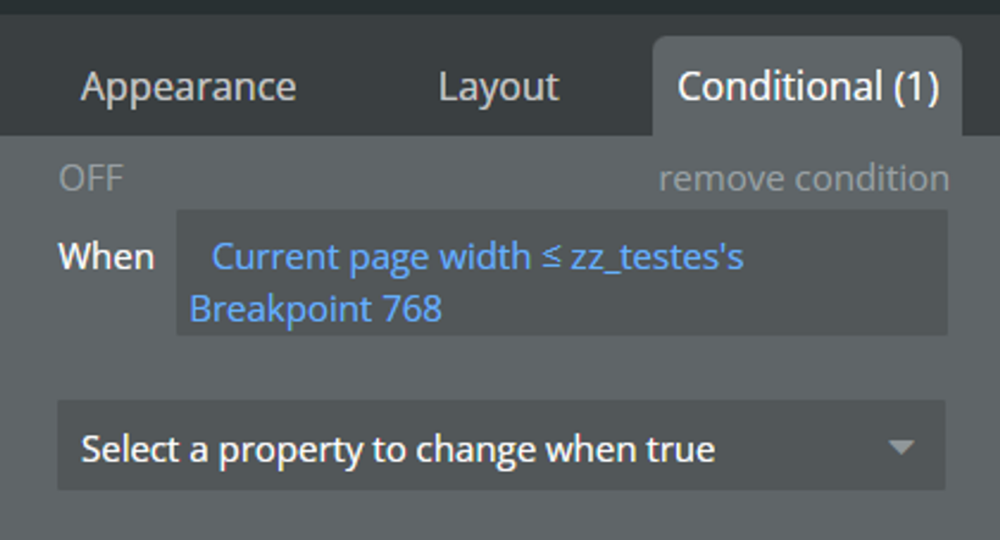
Dynamic breakpoints within Custom States
When adding conditionals from the current page width outside of the suggested breakpoints, use a custom state in the page/parent element, and then pull those breakpoint numbers to the conditionals you need.
That way, when you need to change those numbers, you only need to replace them in one place.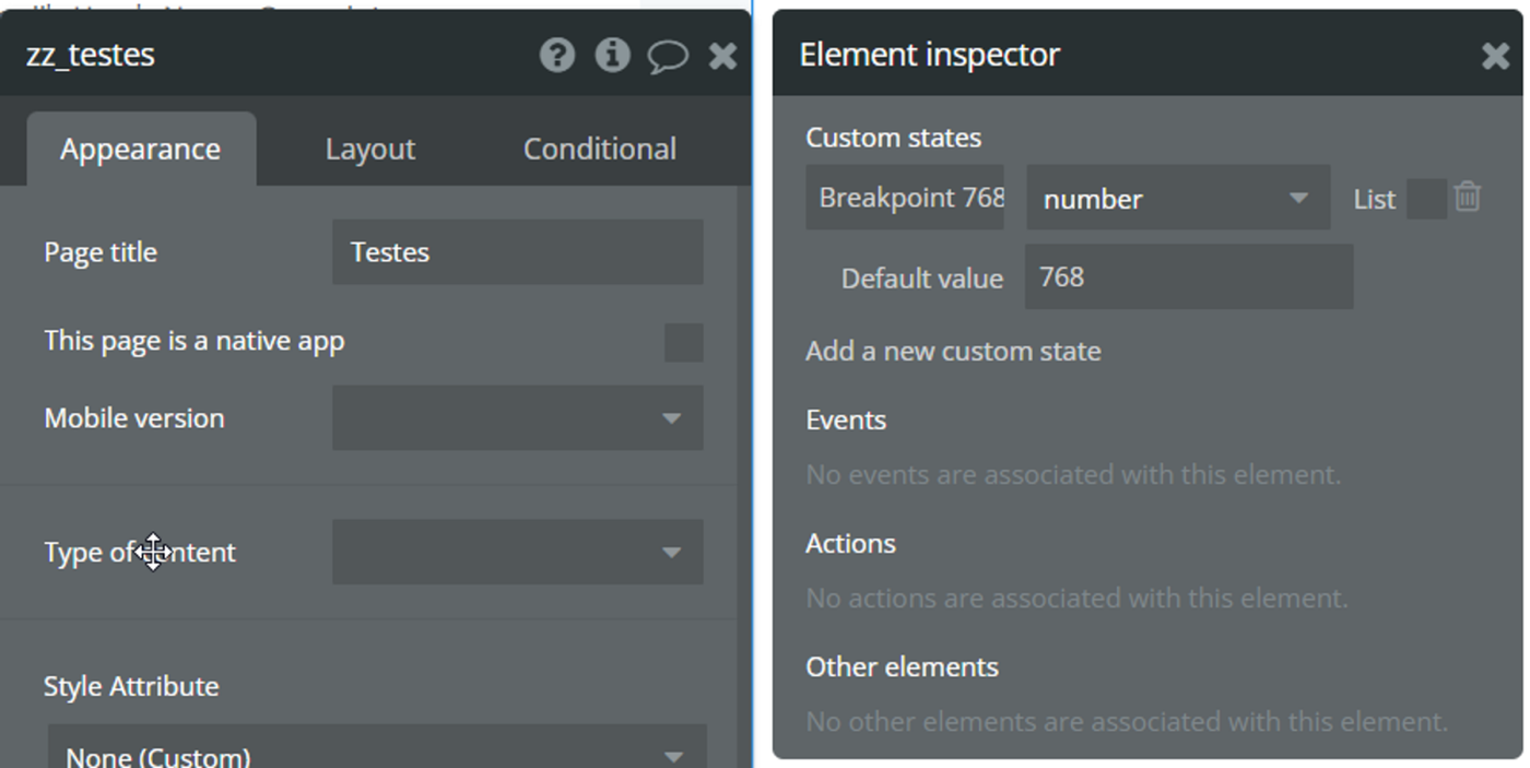
Sidebar Width
Normally from 240px(ideally) to 320px (maximum). Minimum of 200px.
Button sizes and form elements
- Our buttons use the standard of 40px of height, up to 48px. The very bare minimum can be 36px.
- For width, try to keep the Fit-to-width feature, but with a minimum width of at least 100px. If you have multiple buttons in a column, try to have all of them with the same minimum width as the biggest button on that column.
- As for inputs, we use inputs within a group and icon (with 40x40 pixels). Please make sure to always test those on mobile. Usually, you will need to put a minimum of 150 pixels but may require a conditional to behave differently in mobile as to use the full row width when displaying one input group per row.
- For column gaps, row gaps, padding, and margins, we use a multiple of 8 pixels. Minimum of 8, increasing by 8.
Performance Docs
When creating a searchable table, make it as only the field that needs to be shown in that immediate search result is in the main table, and any other fields are in a relatable table.
For example, in a Search for the table Places, we have the “searchbles” fields Name, address, reviews counters, and maybe a first image, and then a field relating to another table “place-details” which holds all the images, description, tags, and other relations to the table. It's usually a simple industry standard, but this makes a huge difference within the Bubble structure.
Documentation
“When I made this, only me and God understood it. Now only God does.”
Use Bubble’s information tool (💬comment) on the top right of elements to add information whenever you create something of medium to high complexity.

These are easily accessible to every developer later:

- Comments within Events and Workflow Steps need to have the purple book emoji (Emoji should be on both the Event and the Workflow Step)
- Make sure you add relevant comments on API Workflows