UI Elements
This SOP provides guidance on the recommended use of different UI elements.
Choosing between pop-ups (modals) and drawers (side panels) depends on context, user flow, and the level of interruption you want in the experience.
🧱 Pop-ups (Modals)
Use when you need to interrupt the current flow to capture the user’s full attention for a short, focused task or decision.
✅ Good for:
-
Confirmations and alerts (e.g., “Are you sure you want to delete this?”)
-
Critical actions (e.g., submit, sign out, approve/reject)
-
Focused data input (e.g., short forms, login, quick edits)
-
Context-specific content that must be handled before continuing
🚫 Avoid when:
-
The action is not urgent or blocking
-
The user needs to reference background content
-
You expect multiple sequential interactions (can feel heavy)
💡Tip: Pop-ups should be short-lived, easy to dismiss, and always clearly indicate what action the user is taking.
📂 Drawers (Side Panels or Bottom Sheets)
Use when you need to show or edit secondary content without completely leaving or blocking the main page.
✅ Good for:
-
Viewing or editing details (e.g., user profile, item info, settings)
-
Multi-step tasks or content that complements the main view
-
Filtering or sorting data (e.g., search filters, advanced options)
-
Navigation or contextual menus
🚫 Avoid when:
-
The task requires the user’s full focus or confirmation
-
The content is too large or complex (use a full page or modal instead)
💡Tip: Drawers are great for maintaining context — users can still see the main screen behind and understand where they are in the flow.
⚖️ Quick Summary
| Situation | Use |
|---|---|
| Requires immediate attention | Pop-up |
| Complementary or contextual task | Drawer |
| Short confirmation or warning | Pop-up |
| Edit/view details while staying in context | Drawer |
| Multi-step or complex flow | Drawer or Full page |
Information hierarchy and navigation clarity really matter. Using multiple levels of tabs (often called nested tabs) can get confusing fast if not handled carefully.
🧭 First: Understand the Two Main Types of Tabs
There are generally two types of tabs you’ll use in UI design:
1. Primary Tabs (Top-level navigation)
-
Usually appear at the top of the screen or page
-
Divide major sections or categories within the same context
-
Think of them like "chapters" of a section
Examples:
-
In a project dashboard: Overview | Tasks | Files | Activity
-
In settings: Account | Notifications | Billing
🟢 Best for: high-level sections
🔴 Avoid for: sub-categories or content inside content
2. Secondary Tabs (Sub-tabs or Inline Tabs)
-
Appear inside a specific tab or section
-
Divide related content within that single area
-
Often shown as smaller, lighter, or underlined tabs
-
Can be vertical (left-aligned) or horizontal, depending on content density
Examples:
-
Inside “Tasks” → Active | Completed | Archived
-
Inside “Settings > Notifications” → Email | Push | SMS
🟢 Best for: organizing sub-content within one section
🔴 Avoid for: switching between unrelated contexts
⚖️ When You Have Nested Tabs
When you have both, think in terms of hierarchy and frequency of use:
| Level | Type | Purpose | Placement |
|---|---|---|---|
| 1️⃣ Primary | Major sections | Top of the screen/page | Prominent, larger styling |
| 2️⃣ Secondary | Sub-sections within one area | Just below header/content | Lighter styling, smaller font |
💡 Tip: Always make sure users can tell at a glance where they are — visual hierarchy and breadcrumbs help a lot here.
🧩 Practical Rules of Thumb
-
Never stack more than two levels of tabs.
→ Beyond that, switch to accordions, subtabs, or side navigation. -
Use vertical tabs (left-aligned) when there are many subcategories — this keeps space open for content.
-
Avoid mixing visual styles (e.g., two rows of identical-looking tabs) — users won’t know which level they’re in.
-
Primary tabs = navigation, secondary tabs = organization.
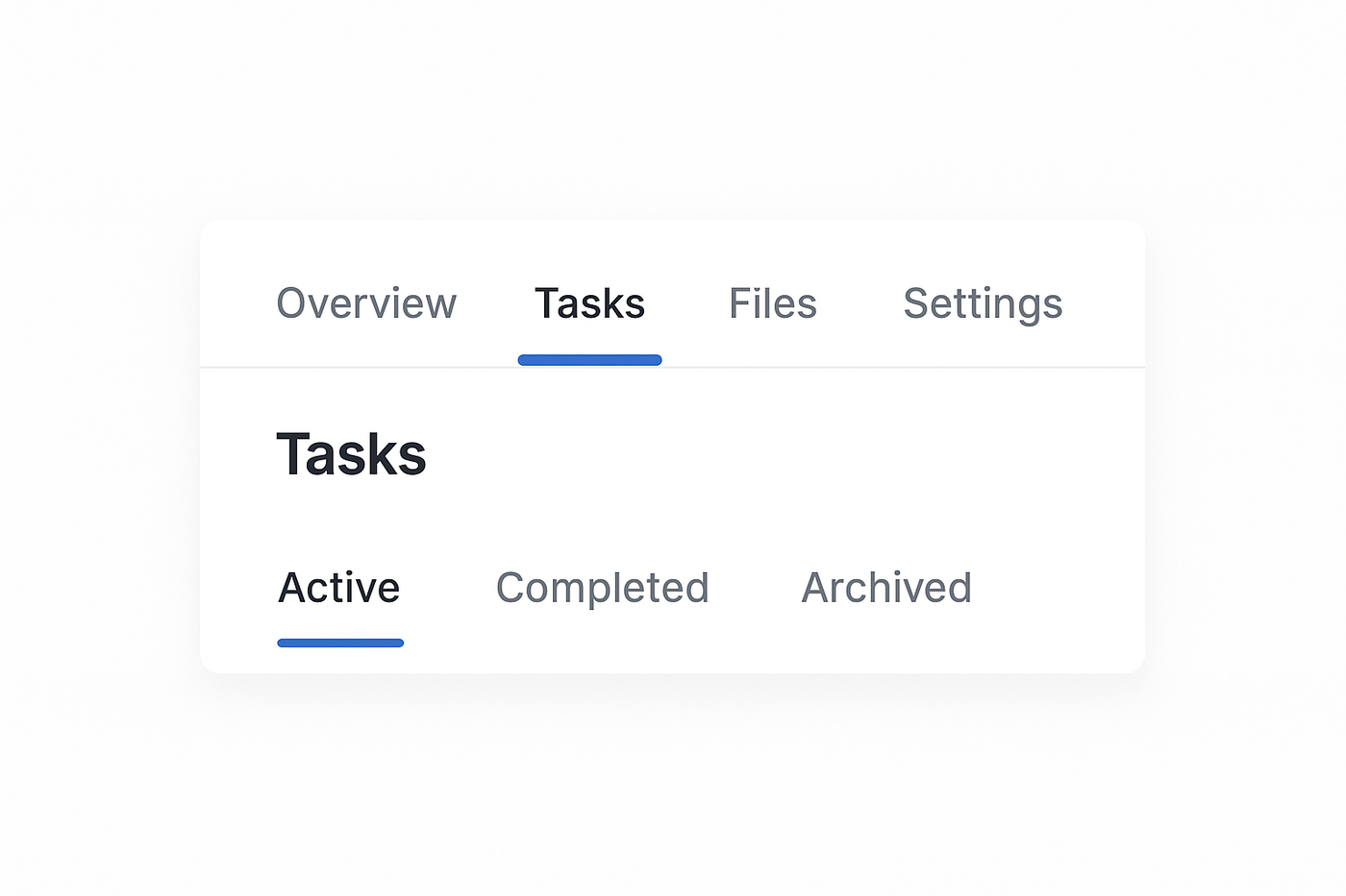
Something to consider regarding the image shown above:
🧭 Scenario A: Context stays consistent (no need to repeat the title)
If “Active / Completed / Archived” only exist inside the “Tasks” tab, and users always see the “Tasks” label at the top:
→ ✅ You don’t need to
repeat “Tasks” again inside the content.
It’s clear where they are because the primary “Tasks” tab is already active.
🧩 Scenario B: Content can appear elsewhere (title helps reorient)
If those same “Active / Completed / Archived” tabs appear inside another section,
like in “Overview” (e.g., showing a summary of active tasks),
or if that view can be opened in isolation (say, from a direct link, modal, or drawer),
then the user might not see the main “Tasks” tab
Nested tabs UI examples: