Glide Key Points
Button Layout:
In Glide’s native button block, the default layout places the Primary button on the left and the Secondary button on the right (e.g., Submit left / Cancel right).
We recommend reversing this order by positioning the Secondary button on the left and the Primary button on the right. This aligns with common UX patterns where the dismissive action (e.g., Cancel) appears on the left—indicating a "step back"—and the affirmative action (e.g., Submit, OK) appears on the right—indicating a "step forward."

Title/ Sentence Caps standards:
1. Title Case
-
What it is: Capitalize the first and last words,
-
Example: Submit Your Application
-
Best for:
-
Buttons, headings, and titles where you want emphasis.
-
This enhances clarity and visual balance.
-
2. Sentence case
-
What it is: Capitalize only the first word and proper nouns.
-
Example: Submit your application
-
Best for:
-
Body text, help text, and sometimes buttons in minimalist or modern UIs.
-
More casual or conversational tone.
-
Summary Recommendation:
- Buttons and headings: Use Title Case
- Tooltips, labels, and descriptions: Use Sentence case
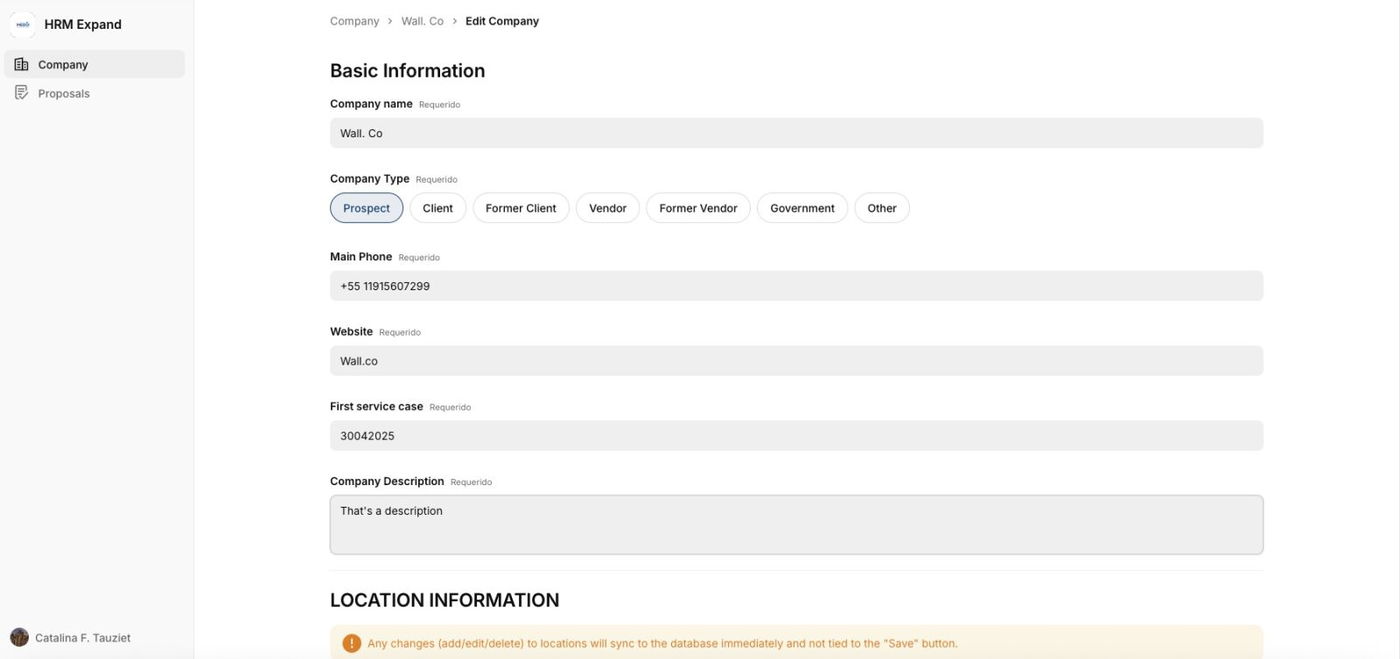
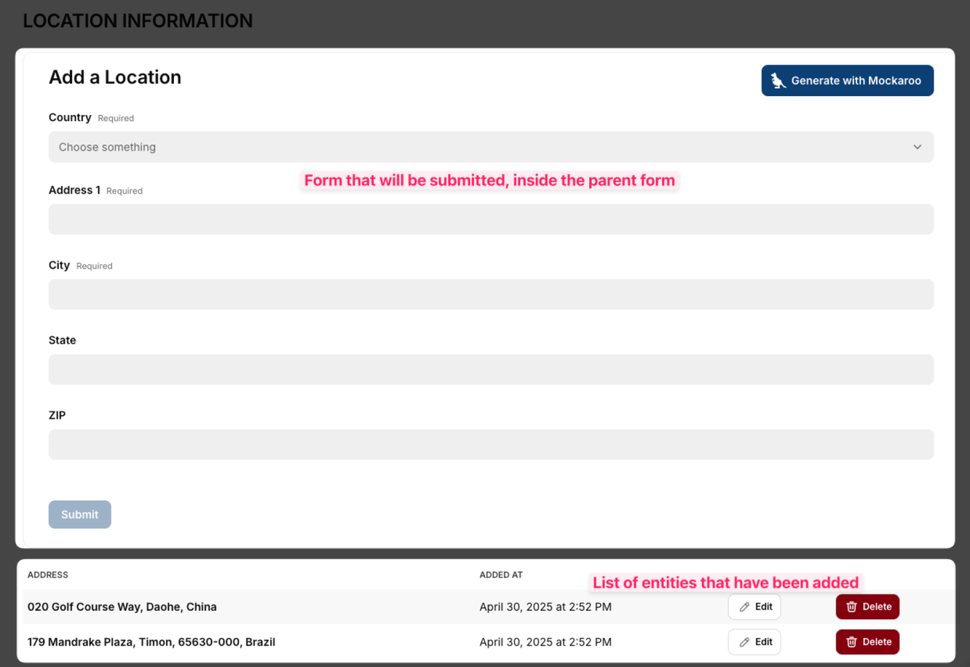
Form inside form:
Problem:
- Glide doesn't support the "Add more" button
- We can't add multiple sets of components upon a button click in Glide.
- One form, allows people to have multiple types in one row.
- That means edit only needs to happen in one place.
- Efficient database design (related to rows count).
- Follows the form-inside-form approach that is suited for Glide.