Figma Tips
These are some cool Figma tips to know!
🔍 Find words and replace:
-
-
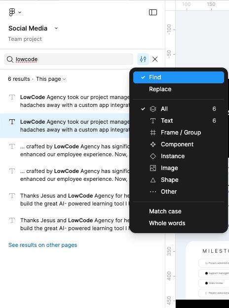
Press in the Nav Bar the magnifying glass or simply click Ctrl + F and type the word you're searching for in the search bar, then hit Enter.
- Figma will highlight all instances of that word.
-
In the filters, choose "replace".

- In the bottom input, enter the word you want to replace it with.
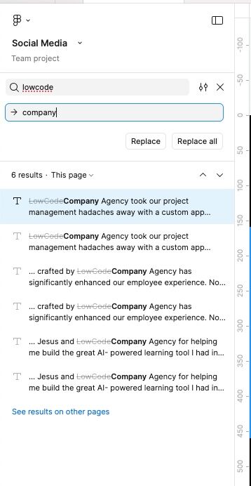 5. Choose Replace to change one at a time or Replace All to update every instance.
-


📐 How to Set Min and Max Width for Auto-Layout Components
-
Set Min Width:
Go to the Width settings and click on “Add min width”. Enter the minimum width value you want the component to shrink to. -
Set Max Width:
Still in the Width section, click “Add max width” and input the maximum width the component should grow to. -
Apply the Same for Height:
You can repeat the same steps in the Height section to control the component's vertical behavior.
📦 Working with "Wrapped" Auto-Layout
This becomes especially useful when your auto-layout is set to wrap.
What does "wrap" mean?
It means that when components reach their max width, and there’s no more space, they’ll automatically move to the next line.
Key Setup for Wrapping Behavior:
-
Make sure your component has min and max width defined.
This allows it to stretch and shrink as needed. -
Add the component to a frame, and set it to "Fill container".
This tells the component to expand as much as it can within the available space. -
When new components are added, they will move to the next line
once the existing ones hit their minimum width and can't shrink further. This prevents layout breaking.
Example:
Let’s say you have a card with an image on the left and text on the right.
-
Set each element (the image and the text) to "Fill container", and define a minimum width for both.
-
Set the card layout to "Wrap".
Now, as you resize the card and make it narrower, each element will shrink—but only until it reaches its minimum width. Once that limit is reached, the layout will automatically restructure (e.g., stacking the elements vertically) to respect those minimum widths and maintain a clean, functional design.
🔨 Figma Component System: Guide to Components, Properties & Variants
Creating a Component
Select the element you want to turn into a component and click “Create Component” in the right panel (it looks like a diamond icon). Once it's created, the element will appear in purple, indicating it's now a component.
Parent and Child Components
What you’ve just created is a parent component. When you duplicate or reuse this component, you’re creating child components.
-
If you make changes to the parent, all its children will be updated automatically.
-
If you change a child, only that specific instance is affected.
You can create a child by copying and pasting the parent, or by going to the Assets tab in the left-hand navigation and dragging the component onto your screen.
Component Elements and Visibility Toggles
A component can contain multiple elements, and you can control the visibility of those elements using toggles. This is helpful for optional UI elements like helper text, tooltips, or icons.
Creating Visibility Toggles with Boolean Properties
-
Select the element inside the component that you want to show or hide.
-
In the right-hand panel under Appearance, click the third icon (“Apply variable/property”), then click “+” to create a new property.
-
Name the property something descriptive, like “Show helper text”, and set its value to
trueorfalse, depending on whether you want it to be visible by default.
Example:
If you have an input field and a frame below it that contains helper text, assign the “Show helper text” property to the frame.
Then:
-
Select the text inside the frame.
-
Under Text in the right-hand panel, click the “Apply variable/property” icon next to the text content.
-
Click “+”, and either reuse the “Show helper text” property or create a new one.
-
Set the value to
trueorfalse. This lets you control both visibility and content dynamically.
Binding Custom Text Values
To allow editing of the text content in child components:
-
Select the text element.
-
In the Text section of the right-hand panel, click the “Apply variable/property” icon next to the content field.
-
Click “+”, choose Property, name it something like “Text value”, and in the Value field, type the default content (whatever you want the text to say).
Thanks to all these properties, when you create a child component (by copying and pasting the parent), you’ll be able to:
- Toggle the helper text on or off using the boolean property
- Customize the actual text content using the text property
Using Variants for Component States
Creating a Component Set
-
Select the component you want to add variations to.
-
In the right-hand panel, click “Add Variant”.
-
This automatically creates a component set, which groups multiple variations of a component.
A single component becomes a component set when you add variants. Variants let you manage different states like default, disabled, or error in a clean and scalable way.
Figma will automatically assign names like:
-
Property 1 = Default
-
Property 1 = Variant 2
Renaming Properties and Variants for Clarity
To stay organized:
-
Select the first variation in the component set.
-
Rename the property name (in the right panel) to “Status”.
-
Update the property values to reflect their purpose, such as:
-
Default -
Disabled -
Error
-
Repeat for all other variants to maintain clarity.
Adding a Second Variant (e.g., Size)
Now let’s say you want the same component in different sizes in addition to different statuses:
-
In the components, add a new variant.
-
Resize it or adjust its layout as needed (e.g., padding or font size).
-
Duplicate it the times you need and change the status of each one of them
We need to name it correctly so we keep these two dimensions (Status and Size):
-
Go to the left-hand panel and select the component set (not a single variant).
- Double click and change the layer name to "Status= Default, Variant=Big"
So now, on your right panel, you will see that the component set includes two dimensions:
-
Status = Default, Disabled, Error
-
Size = Big, Small
Using Variants in Child Components
Once your component set is fully configured:
-
When you drag a component into your design (creating a child), you’ll see dropdown menus in the right-hand panel.
-
These dropdowns let you switch between different Status values (Default, Disabled, Error) and Size values (Big, Small).
This allows you to manage complex UI components easily without duplicating entire sets for every possible variation.